With most energy simulation, you’ll produce a large amount of simulation data, but what does it mean?
Without seeing your data in a meaningful way, does it actually mean anything?
With gEnergy, data can be charted and viewed the way that you want to using gEnergy’s customisable dashboard based charting.
gEnergy’s dashboard based reporting allows the adding and removing of custom charts, edit existing charts, select hourly, monthly, and annual result parameters. Mix and match reports to meet your needs.
All simulation results can be exported and downloaded from gEnergy for further analysis in downstream tools, e.g.Microsoft Excel as well as presented from gEnergy’s web interface, which is accessible anywhere.
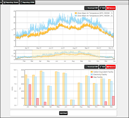
gEnergy’s customizable reporting interface is clean and easy to use.
You can learn more about gEnergy’s features here.
Or why not start a free trial here and experience the power of gEnergy today.